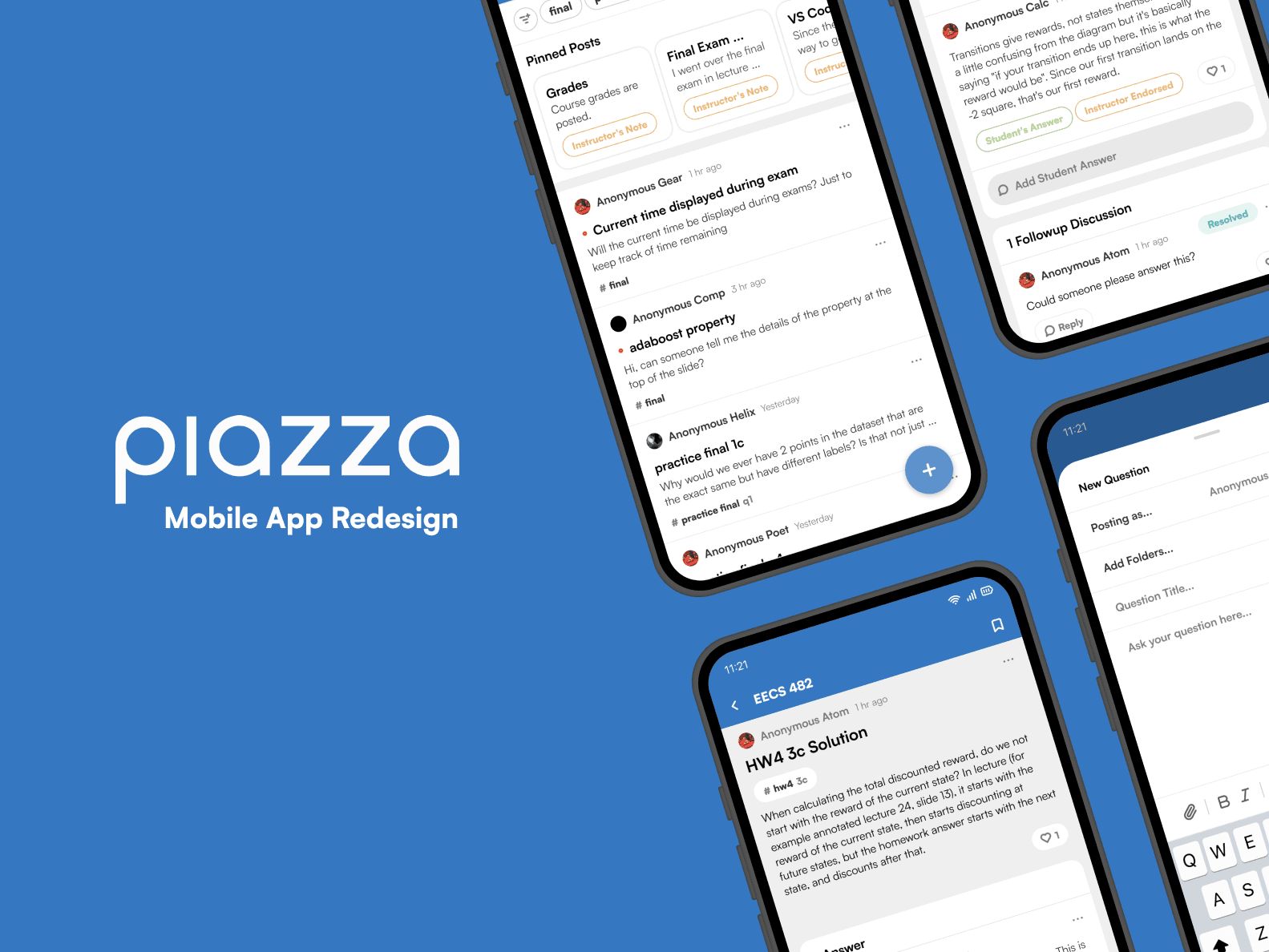

Piazza Mobile App Redesign
Personal Project
Overview
Role
Tools
Members
Duration
Overview
Piazza's mobile app suffers from its unintuitive interface, unnecessary clutter, outdated + unengaging design, and lack of features available on the web app.
Piazza is a widely used Q&A platform that facilitates interaction between instructors and students, and has been integrated into many universities for homework help and exam preparation. Its collaborative environment and support for anonymous posting encourage student engagement beyond classroom hours, making it an essential tool for many educators. However, despite its valuable features and large user base, Piazza's mobile app suffers from significant usability issues. Users often struggle with its unintuitive interface, poor navigation, cluttered pages, and the absence of key features available on the web version.

WHY I CHOSE TO REDESIGN PIAZZA
As a student who uses Piazza for many university courses, I've often found the mobile app to be incredibly frustrating. While the purpose of the mobile app is to make the platform more accessible and convenient on the go, its core features are overshadowed by unintuitive buttons and overly complex screens. My goal is to redesign the app to both improve its usability and practice my UI/UX design skills—ultimately seeing how much more seamless and user-friendly the experience can become.
STEP 01. Research + Analysis
ANALYSIS OF PROBLEMS
Unintuitive Interfaces and Flow
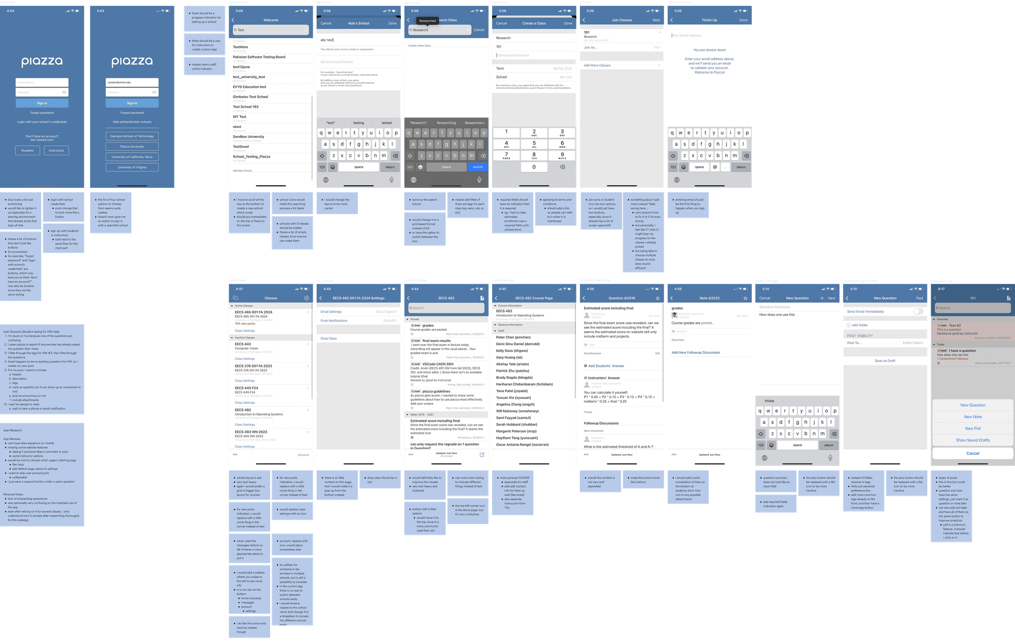
Lots of buttons that just don't look like buttons! A lot of the buttons are literally just floating text that users wouldn't know to click. The onboarding flow is also very confusing, which could cause the user to doubt if they are setting up the account or class correctly. Posting a new question or message into the channel also gives the same doubtful sentiment. We want users to be confident when going through each step.
Unnecessary Clutter
There are several screens and components that would benefit from being simpler, especially with the phone being such a small screen. Since the app is already very text-heavy being a forum platform app, a lot of the text components can be simplified to familiar icons or colors (e.g. “An instructor endorsed this answer” can be an icon instead, reducing the amount of space it originally takes).
Outdated and Unengaging Design
As an educational app, users already have a dull and unenthusiastic emotion towards Piazza. It could definitely benefit from a more modern and engaging look by updating the colors to be more vibrant and having more spacing between the blocks of text.
Lack of Features Available on Web App
Features such as editing or deleting responses, creating posts with complex functions or spacing, and more are available on the desktop version but not in the mobile app. Adding these feature back in would make allow both instructors and students to have a better time using the app for their needs.
USER RESEARCH
User Interview Guiding Questions
- Have you ever used the Piazza mobile app?
- What are your general feelings towards it?
- Do you think it's a good tool for last minute review and why?
- Are there features it could improve on?
- Do you find it useful for things like homework or project help?
- Do you use the web or mobile version more and why?
- Have you used similar apps and how would you compare them to Piazza?
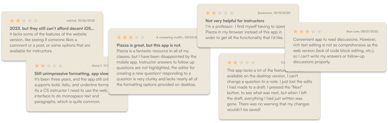
Public App Reviews (App Store & Google Play)

RESEARCH INSIGHTS
- Most students preferred the web version due to better navigation.
- The mobile app was mainly used on the go, but students found it unreliable.
- Users wanted faster access to class threads and better posting tools.
- Reviews from the App Store & Google Play echoed these frustrations.
STEP 02. Design Process
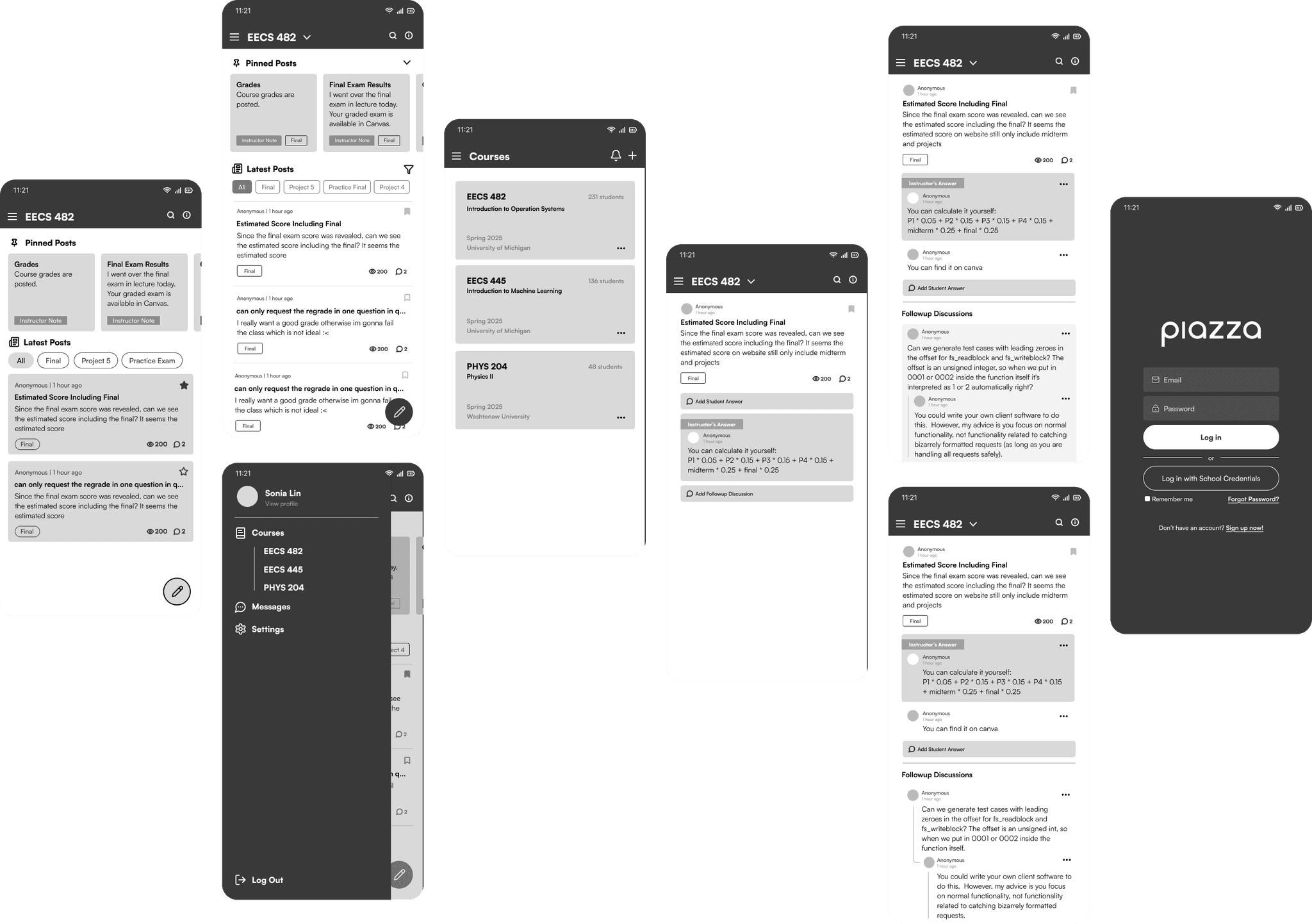
WIREFRAME + LOFI-MOCKUPS
HIFI PROTOTYPE
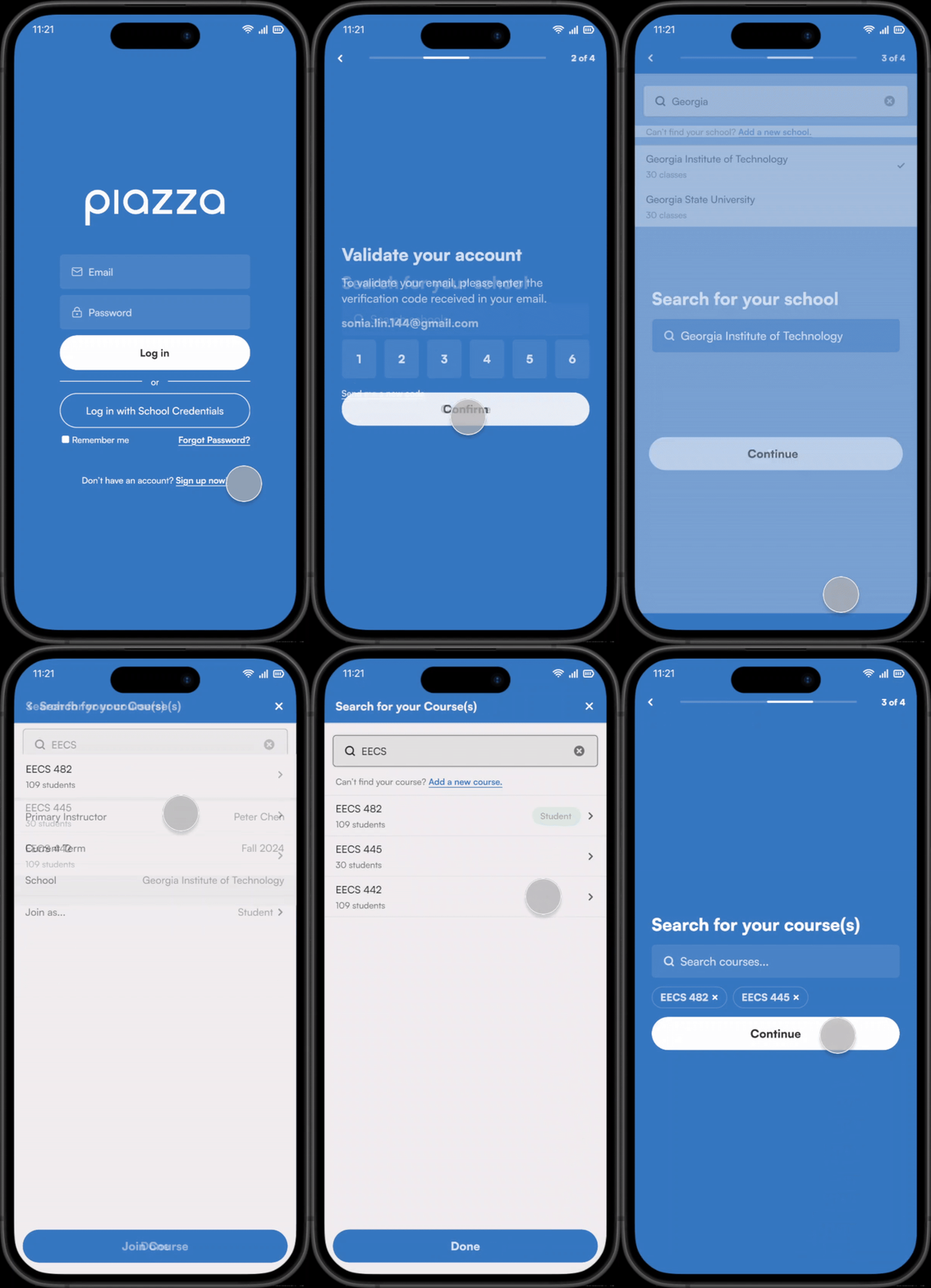
Improved Onboarding Flow
I redesigned the onboarding to be more intuitive by moving email registration before school/class selection and adding a progress indicator. This gives students clarity and confidence throughout setup.
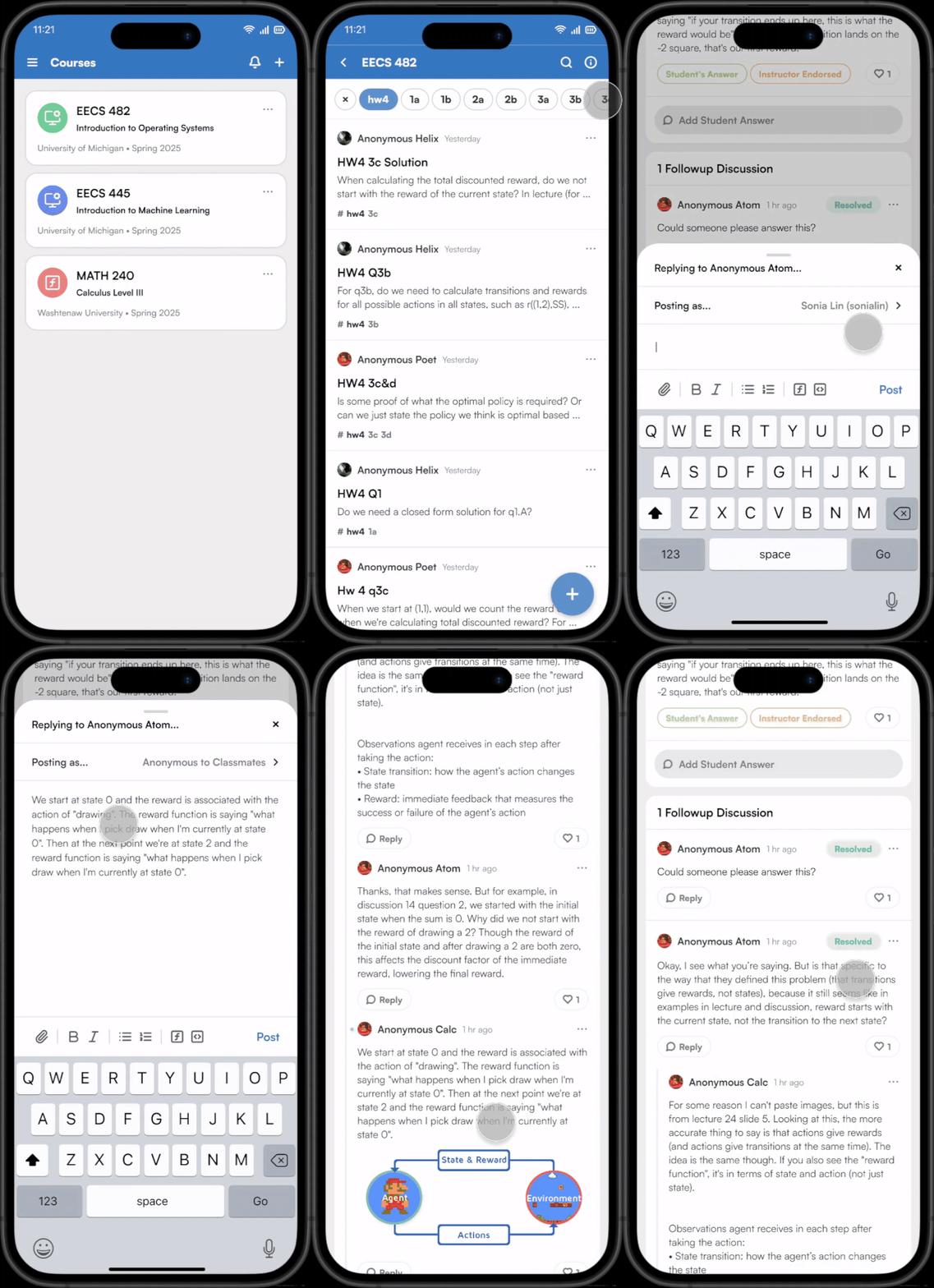
Viewing Posts & Replies
I improved visual clarity by replacing dense text with familiar icons, adding better separation between responses, and introducing clearer buttons for replying. This makes discussions easier to read and engage with.
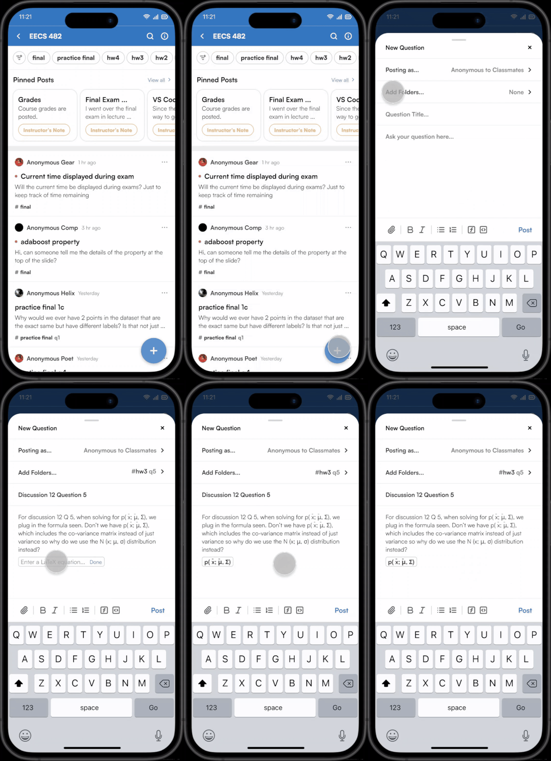
Posting Questions & Notes
I added support for math equations, functions, and text formatting—features previously limited to the web app. This brings parity to mobile and makes creating posts more powerful and flexible for instructors and students.
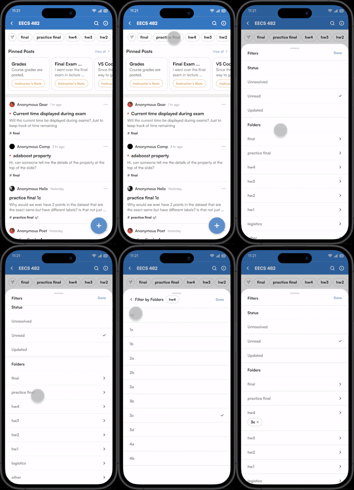
Filtering Posts
I introduced tags and folders to the mobile app, with the ability to navigate into subfolders for specific questions. A quick access tag list supports fast filtering, while a dedicated filter page offers more granular control.
STEP 03. REFLECTION
FUTURE STEPS
Although this was a personal project, if I were to continue, I would:
- Conduct usability testing with students to validate the redesigned flows.
- Measure task completion times (e.g., posting, filtering, onboarding) compared to the original app.
- Collect qualitative feedback on clarity, ease of navigation, and overall satisfaction.
- Iterate further based on insights from usability testing.